top of page
Radio and OOH Ads
First Step VA
First Step VA is a
_edited.png)
Theme Rational for Portfolio
Potential Color Schemes
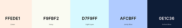


Used Color Scheme

The colors that were used for the final portfolio were chosen to align with the name of the agency, Blue Ridge Branding. The color blue is also associated with qualities such as trust, professionalism, and reliability. The color scheme used emphasizes these qualities and shows that Blue Ridge Branding is a trusted agency that produces quality advertisements. The pure white and pure black provide a contrast to the blue and are used as accent colors for the portfolio.
Font
The font used throughout the website is Helvetica. Helvetica is a clean and easy to read sans serif. Because there are no decorative elements on the font, it is simple, effective, and timeless. The copy throughout the website serves as an aid to guide viewers through the website and does not create a distraction from the work being shown.
Images
There are few images on the website that are not the work of the agency. The image on the home page of the portfolio is of the Blue Ridge Mountains and is used as a visual representation of where the agency resides. The other images used on the home page serve as an aid to help viewers visualize the type of advertisements the agency has created.
Flow Chart

References
Southern Living. (n.d.). Why are the Blue Ridge Mountains blue? [Photograph]. Southern Living. https://www.southernliving.com/travel/why-are-the-blue-ridge-mountains-blue
bottom of page